Continuing with the discussion of my MAKEcation art project introduced in an earlier posting, I’ve had a general idea of how I’d like these paintings/carvings to look — that is, the feeling I’m going for — yet, I’m not really sure about the specifics of how I’m going to do it. I am sure it will continue to evolve over time. But to get started I figured I needed to do some experimenting. For that, I clipped out a piece of the of the practice image/model/crv.file I previously used to explore how Aspire works (see earlier post). I thought I’d cut a bunch of these little sample regions, vary the machining techniques a bit, and then try some painting to experiment with methods.
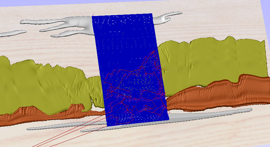
Area that I toolpathed to use as sample for testing.
Well I’ve done some of it — and after this experimenting I’m still enthusiastic about the painted bas-relief approach — though in the course of this practice exercise, I learned a lot. I learned about both practical technical issues and I learned about some things that don’t work from an aesthetic perspective. And I learned the same thing I always learn when I take up a new project — things take a lot longer and are usually harder than you expect.
Technical bas-relief issues: The problem beginners usually have with bas-relief carving is that of coming to appreciate how tricky it is to use low relief to convey form and depth. In these types of carvings, one only has a little overall depth to work with to evoke the feeling of shapes and forms. This means that you must somehow use edges, transitions, and gradations within a narrow range to achieve suggestions of greater depth and contour than really exist. I was a little cocky and thought I understood all this, but in reality it is much harder to achieve the effects one wants than you would expect. (And, it’s the kind of thing that experts like James Booth are so good at.)
The one thing we all have going for us in working with shallow carvings is that human perception, to a degree, can be tricked. And, it is such trickery that the experienced practitioners of this art have learns to exploit. Here’s a classic example from perception science of how these kinds of tricks of the eye ‘work’. It’s a phenomenon know as the Cornsweet Effect or Illusion.
 In the pattern on the left, for most of us, the rectangle on the left looks a little darker or lower than the one on the right.
 If we looked at a graph of perceived darkness or depth in cross section across the two rectangles, what we perceive is something like this when plotted out.
 However, the actual grayness of the rectangles (and the transition between them) is depicted to the left. The two rectangles are the exact same gray. You can convince yourself of this by just laying a pencil or your finger across the transition area and then comparing the two sides. You’ll see they are equal darkness. It is the shading transition or simulated contour that suggest a difference that does not exist — fooling our perception into thinking there is more there than the reality. That is, the slight fade-in/fade-out at the edge evokes the perception of a difference on the two sides that does not exist.
The reason that this and most illusions work, and that we can employ tricks like this in bas reliefs, is that our perception is not an accurate mirror of the environment around us. Rather, it is a construction that we build up in our heads as we look out into the world. Because our processing powers are limited in bandwith, the construction is built up from relatively simple processes — basically mental shortcuts. They help us make relatively good but quick guesses about the nature of something that we are looking at. When the data are limited, the shortcuts can mislead us. In the absence of other types of data, such as perspective or parallax, we use the apparent contour created by shading to form our interpretation of the scene. Thus, you generate or enhance the perception of depth in a bas relief by carefully working the gradations at transitions to heighten the perception of relative depth.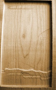
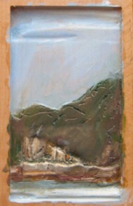
Well …, I thought I knew about this kind of thing, but my initial 3D models were all too flat and they did not exploit building-up and rounding-over edges to create greater depth effects. Here’s an example. Note how you can hardly see the contours in the background … even though I thought I had distinctively manipulated the height of regions. But I was thinking about them in terms of the reality that I knew (i.e. trees far in the background), and did not initially model them distinctively enough to convey much of anything. Better inspection of the preview simulation might have helped, but at the time I didn’t understand what I was really looking for.
So I reworked my practice carving/painting to enhance the background appearance. And then again tried generating a bunch of samples of the carved region to do test painting. One of the techniques I wanted to evaluate (mentioned previously) was the inclusion of v-carved lines within the modeling. I’ve been impressed by the way drawing on a Wacom tablet allows you to control the width of a drawn line by pressure on the stylus. The Aspire software will translates lines of varying widths into v-carved depths and I was interested to also apply this technique to convey a bit of the feel of a a cross between drawn and carved lines in the resulting piece. What is really neat about Aspire’s capabilities is that these v-carved lines can be applied on top of the 3D modeling and their depth will be modulated so that the line width remains correct, even as it moves across undulating areas.
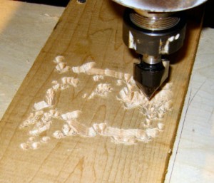
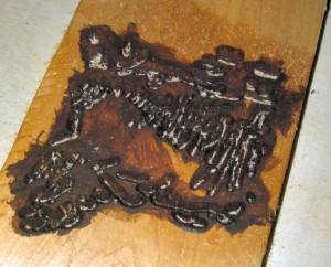
I did some samples with and without the v-carving added to the sample area. I also did some samples where I did the v-carving first so that I could pre-paint the lines before doing the raster cutting of the rest of the model. I was hoping this might allow some tight detailing in the final picture that would be hard to achieve without tedious brush work. The 3 images below show the v-carving (left); the carving as it looks on top of the 3D form (center); and a pre-painted v-carved area, before the 3D contour cutting is done (right; ignore the sawdust).
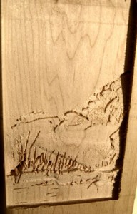
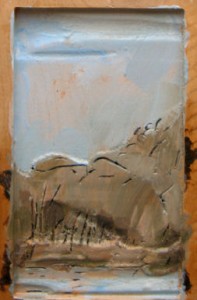
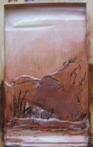
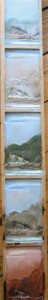 At the left is a test board with 5 of my samples of various painting and color approaches (details and on individual samples shown below). You can see I did have some fun exploring colors with these samples … and that some are more interesting than others. From an aesthetic point of view, I think there are some pretty interesting effects that come from the painting on relief. I had some initial concerns that the effect may be more like a sign than a painting — but I’m less worried about that now. I am disappointed with my v-carving experiment. Here it looks overly busy and more like random scratching than something integrated into the piece. I’m thinking this reflects a need for the drawn lines to be more disciplined and better related to the modeling. As well, I used a 60deg cutter here; next time I’ll try a 90deg in order to reduce the impression of gouging and give better width effects. The pre-painting of the v-carving also did not work particularly well. A thought on this one is to pre-paint and then mask the painting with rubber cement (to be removed later) so that I don’t have to worry about painting over the detail work.
All-in-all, I’m enthusiastic about the next step which will be to develop several serious full-size painting/carvings and produce them. At this point, I’m planning to treat them as a type of 3D print — with a specified number of painting/carvings cut and similarly painted from each design. I’m giving some thought to applying the background colors with a ShopBot having an airbrush, but I enjoy the painting work and I’m not sure I want to automate it.
[These samples show some color experiments; first panel has no v-carving; last two panels have pre-painted v-carving.]
Leave a Reply